Check out my entry to the Chicago Divvy Data visualization
divvy.datasco.pe. Details forthcoming. See the github page (please fork it) for a more up to date description.
divvy.datasco.pe. Details forthcoming. See the github page (please fork it) for a more up to date description.
http://pyvideo.org/video/880/stop-writing-classes
This emphasizes code legibility and concision — which is less of a concern when it comes to prototyping (throwaway) code.
For any code that is meant to last, readability is one of the most important things. Part of readability is concision.
Also: I almost never read packages that I include in my code. I think that’s a big difference, too, between shipping code as a product for someone else and using code to do something for us for right now.
But I liked the main takeaway : if you’re writing a class with two methods in which one of them is an __init__, then you shouldn’t be writing the class.
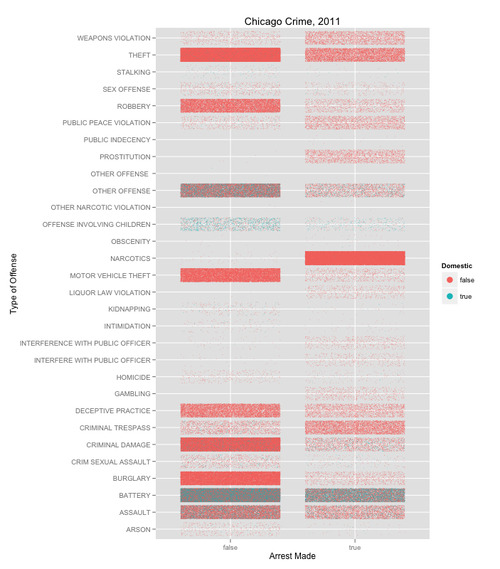
Today I went to the Chicago Visualization Meetup on ggplot2. Two great things happened. 1. I finally have an intuitive sense of what the grammar of graphics actually is – which means I can now think about plotting with ggplot the right way. 2. I made a different kind of heat map with jitter.
At the meetup, I read the introduction to Hadley Wickham’s book, which is freely available on amazon – I highly recommend reading pages 3 and 4.
What the Grammar of Graphics Is
From this I understood that there are three pieces to the grammar of graphics – there are data, aesthetics, and geometries. The idea of the grammar of graphics is to rethink what a graphic is. For Leland Wilkinson, it’s the output of a function which maps data to some visual space – a geometry. Mathematicians have a certain concept in mind with the term geometry – though for most people, a sense of spatial relation is a good place to start. The geometry itself is almost always either discrete or Euclidean – though it is occasionally polar. A discrete example is a bar chart – where e.g. the earnings of two rival companies are being compared, although the distance along the independent axis doesn’t necessarily denote spatial distance at all.1 A Euclidean example is the most natural, maybe – where distance matters – e.g. plotting against time. The polar example is the pie chart – though there are others, too.2
The mapping itself – the function which takes data to the geometry – is an aesthetic. It can have various parameters (color, size, type, transparency, shape, etc.) which affect how the data actually appears in the geometry.
This helps make sense of the actual syntax of ggplot2 – in which every plot has two functions, aesthetics (aes) and geometries (geoms).
–
The other thing I thought through differently today was the use of ggplot’s geom method jitter. Previously, I’d only used jitter in plots where one variable was discrete and the other continuous – so that the jittering happens along the dimension in which space has little meaning (because it’s discrete). Today, we used jitter in cases with two discrete variables – in which case, when the points are small enough, the jittering takes on the affect of pointalism – or a heat map.
Many people who know more about R than I do (I rely on them all the time as a resource and so should you) have talked about heat maps in R and ggplot2 – though these methods fill entire blocks of tile one color. With a pointalist heat map – using jitter – one can see more subtle patterns in the data, if there’s enough of it.
Today we used Crime data from the City of Chicago Data Portal. The inspiration for all of this was from the class – and one of the scripts below is a modification of Tom Schenk’s, who led the session.
The tight tiles and the fact that the density of the points is what communicates the data make this a heat map. But this variation also allows you to see the interactions of multiple color variables. The trick is to set the opacity and size of the points small enough so that you can see the color interaction.
Once again – the aesthetics are critical to the graphic.
library(ggplot2)
# Gabe Gaster
# Data from the Chicago Data Portal https://data.cityofchicago.org/Public-Safety/Crimes-2011/qnrb-dui6
crime = read.csv("Crimes_-_2011.csv")

# Clean the data -- take out typos
levels(crime$Primary.Type)[11] <- "INTERFERENCE WITH PUBLIC OFFICER"
levels(crime$Primary.Type)[22] <- "OTHER OFFENSE"

# Make some graphs
ggplot(crime,aes(x=Primary.Type, y=factor(Arrest))) +
  geom_jitter(aes(color=Domestic), size=I(.3)) +
  coord_flip() + ylab("Arrest Made") + xlab("Type of Offense") +
  opts(title="Chicago Crime, 2011") +
  guides(colour=guide_legend(override.aes = list(size = 4)))
ggplot(crime, aes(x = Ward, y = Primary.Type)) +
  geom_point(aes(color = Arrest),position = "jitter",size=I(.3)) +
  guides(colour=guide_legend(override.aes = list(size = 4))) +
  opts(title="Chicago Crime, 2011 by Ward",axis_ticks=theme_blank())
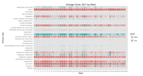
See what I mean?
Full resolution images of the graphs are here and here.
It denotes the discrete distance. ↩︎
This got me thinking – what other geometries are used? The first most natural one to ask is: what kind of data visualizations could you make with a hyperbolic geometry? I’m not entirely sure this question is well posed, because mathematicians use the term geometry differently than data scientists do. In this post, I’ve tried to use the term in such a way that it makes sense in both contexts. ↩︎
This new addition from O’Reilly, the first one to be written on D3, walks users through the process of writing visualizations on open data sources – in particular the MTA’s awesome open data feed. 1
The book starts by walking the uninitiated through some basic visualizations. In so doing, one can learn what D3 actually is.
D3 is and isn’tOn the one hand I would be lying if I said that there wasn’t something frustrating about the experience of drafting a basic visualization in D3. It takes quite a bit of work to get a graph that would be a snap in Excel (…if the data were readily in readable form…) Part of the reason that the experience is frustrating is because there is so much to learn. Part of the reason is that D3 exposes you directly to the data – so the process of assembling any visualization is much more complicated. But there is a light at the end of the tunnel.
Most of the book is on wielding the D3.js library, which handles data and cleanly slots the coder right between the design of the webpage and the data. D3 allows for beautiful style, as its many proponents convincingly show. But, ultimately, D3 is not about style, but rendering. As Dewar sums it up nicely:
The
D3library focuses on the layout, using scales to let us accurately place data…leaving the designer to worry about matters of style.
Dewar uses Python to clean a data set, D3 to manipulate a dataset into a visualization, and other tools (CSS) to get the colors and fonts to look good.
If you are looking for a simple library to output the standard visualizations in a very concise format – D3 is not for you. Rather, D3 allows users to have more detailed controls of the calculations and manipulations that display the data. This allows for considerable freedom in the kinds of visualizations that scientists can come up with – and also makes it simple to add transitions and a UI.
The first example of the book (a color-coded list of the service-status of train lines) demonstrates the way in which the visualization itself is built directly off of the data set. The code literally first lists the names of the data points, then color-codes accordingly.
This is a very novel approach for anyone used to building graphs with pre-fab tools – in something like Microsoft Excel or even R (ggplot somewhat excluded).
In D3, one does not just plot(). This means that a basic example (a bar plot) is comparatively difficult to render. One has to build the bar plot from the data on up (it starts with a list). Once this is accomplished, though, it’s only a hop skip and a jump to interactive visualizations that would be cumbersome or impossible in other frameworks.
If we are witnessing a burgeoning in the development and deployment of novel visualizations, then frameworks like D3 seem like they will be instrumental in this continued growth – if they haven’t been already.
The comparison to artisanal vs. pre-fab construction seems apt. A hundred years ago, plumbers would routinely solder steel piping to fit customized designs. Today, those skills pretty much don’t exist (in the developed world) – short of the rare custom-construction. Rather, piping arrives in a delimited set of designs, which fit together according to a fixed set of rules.
But lest D3 come off as backward – what it really does is allow for the flexibility of artisanal construction while minimizing (as much as possible) the necessary training. But training is required – hence the book.
One neat aspect of the book is the way that the work of visualization is tied to interpretation. The book unfolds the visualization process (which is itself quite detailed, involving the minutiae of every pixel) in parallel to data interpretation or analysis.
The development process of the book is then one of ongoing refinement in which, after each attempt, one asks questions of the data (e.g. ‘are we seeing a diurnal pattern?’) and tries to make the patterns as explicit as possible. It reminded me of Tufte, as each refinement clarifies the mental and physical picture.
As a nice bonus, the reader is exposed to Dewar’s own creative process. Besides dealing with munging problems (getting the data in a usable form), the data scientist often confronts the problem of where to find/supplement/complete the data. This solution, also, is iterative. As Dewar points out, it can including asking an internet user group to make certain data available.
For a concise introduction that covers the basics and leads right into some really neat, slick visualizations – I’d recommend the book.
Add to to-do stack: sleek visualizations of the same for Chicago. ↩︎
When I was just starting out with R, I played with the preloaded data sets – data on cars (just use ‘mtcars’). This allows you to play around the basic commands, summarizing data sets with e.g. summary and plot.
Once you know a bit about this, you quickly notice that you want ways to cut the data, to massage it (reshape it) to get it to look just like you want, and that often you want to cut the data into pieces, and apply a function to each piece.
Enter packages plyr and reshape, by Hadley Wickham, who is way awesome and has written at least 17 R packages. One of the great things about plyr and reshape is that there is a great set of talks that Hadley gave in 2009, with published notes that you can work through on your own.
One of the workshops analyzes baby names with the census set of the 1000 most popular baby names for boys and girls, since 1880. Hadley’s tutorial will take you through a bunch of initial explorations you can do with the data, and even challenge you to do some explorations of your own. e.g. plot the changing frequency of names that start with the letter j.
One question you might ask (Hadley did) is about the popularity of biblical names.
Here’s one of my explorations. Goal: understand biblical baby names over time.
The first step is to pose and hone the problem in terms of something calculable: Plot the proportion of baby names that are biblical, since 1880.
To do this, I needed a list of biblical names.
First, I googled around for such a list. Wikipedia’s list was the first hit. It’s great to find out that my surprisingly complicated problem has been crowd-sourced: the wikipedia community has been generous enough to maintain this list (including citations). The problem is, the list is not in a form that’s easy for me use…
I kept digging to try to find a pre-compiled list, but alas – it seemed that no one had published a list. On wikipedia, the list was sufficiently long (a separate list of each letter) that it would have been a total pain to copy and paste by hand. This is the 'dumb way’.
The “dumb way” is not only dumb because it would waste my time. It is dumb because it precludes one of the main objective of any scientist – that their work be replicable. If I wanted to rerun my experiment, as impractical as it is to copy the list once by hand, it’s near impossible to copy the list twice by hand. Also, importantly, copying by hand would have probably introduced errors into the list. More importantly, taking the time up front (in this case, 5 hours) to teach myself the smart way of doing something is almost always the right approach. Once I’ve invested the time, the method is mine. In fact, one of the main reasons I pursued the project was to learn about this method which I think is essential: 'scraping’.
Scraping is a data science term which refers to sifting through large amounts of somewhat unstructured data and picking out the parts of it that matter to your problem. In this case, I wanted to load each wikipedia page, isolate the biblical names, and turn them into a list.
To do this, I put down R and picked up Python.
I had to learn about calls to 'httplib2’, remind myself how regular expressions work, and then look at the source of the wikipedia list. The idea is straightforward: break it into chunks. This is the computational analog of an adaptation of George Polya’s heuristic, which I learned from Japheth Wood:
If there’s a hard problem you can’t solve, there’s an easier problem you can’t solve.
 import httplib, re

 def findName(text):
      a = re.match(r"(<.+>)?([A-Z][-'a-z]+)(</a>)?,", text)
      if a: return a.groups()[-2]

 def main():
      h = httplib2.Http('.cache')
      url = 'http://en.wikipedia.org/wiki/' +
      'List_of_biblical_names_starting_with_'
      letters = ("A" "B" "C" "D" "E" "F" "G" "H" "I" "J" "K" "L" "M"
                 "N" "O""P" "Q" "R" "S" "T" "U" "V" "W" "X" "Y" "Z")

      f = open('BiblicalNames.txt','w')
      f.write('Biblical Names\n')

      for letter in letters:
           print 'Querying letter '+letter,
           url_iter = url + letter
           page = h.request(url_iter, "GET")[1]
           print 'Analyzing letter '+letter

           ## from <ul> to </ul>, grab the second one
           text = re.split(r"</?ul>", page)[1]

           ## split it up into lines.
           lines = re.split(r"<li>", text)
           for line in lines:
                name = findName(line)
                if name:
                     f.write(findName(line)+'\n')
      f.close()

 if __name__ == "__main__":
      main()
Finally, in R:
  library(plyr)
  library(reshape2)
  library(ggplot2)

  bibnames <- read.csv('BiblicalNames.txt')$BiblicalNames
  bnames$bibl <- is.element(bnames$name, bibnames)
  bibpop <- ddply(bnames, c('year', 'sex', 'bibl'), summarise,
      tot=sum(percent))
  bibpopT <- subset(bibpop, bibl==TRUE)
  qplot(year, tot, data=bpopT, geom='line', colour=sex,
      ymin=0, ymax=1)
Which lets us see easily see it. As you can see–male biblical baby names are currently at a 70 year low.

Download the code yourself from my github.
hello world.
Note: This works for OS X 10.8.2 and Chrome 22.0.1229.94
Open up the Terminal (see this tutorial, for example) and then type:
cd ~/Library/Application\ Support/Google/Chrome/Default
and hit enter.
This takes you to the right folder – which is otherwise defaults to hidden when using the typical Mac Finder. Then if you want to restore the Bookmarks file (which is called Bookmarks), all you have to do is restore from the backup, which is called Bookmarks.bak.
Here is one way to do that.
First, make a backup of your current Bookmarks file, in case anything goes wrong. Do that by typing:
cp Bookmarks ~/Desktop/.
and hit enter.
This copies the file called Bookmark – which is the backup for Bookmark into a folder that you regularly have access to – such as the desktop.
Then, to get Chrome to use the backup Bookmarks file which it will load the next time Chrome starts up, type:
mv Bookmarks.bak Bookmarks
Which renames the Bookmarks.bak file “Bookmarks” and, in so doing, deletes the old Bookmarks file (which is why we made a copy earlier, just in case).
Now restart chrome–if everything looks good, great! Otherwise you can always go back to the way it was before, from the same terminal window that you have open by typing:
mv Bookmarks Bookmarks.bak
cp ~/Desktop/Bookmarks .
Then, if you reopen Chrome, bookmarks will be as they were before.